

Marrow Coffee
A bold, honest identity for a roaster obsessed with origin and craft.
Marrow wanted a brand as direct as their espresso. We leaned into heavy type, raw texture, and unfiltered storytelling. The identity feels warm, confident, and built to last.

Type
Branding
year
2025
client
Marrow Roasters


The Challenge
Bold to the bone
We anchored the identity in a heavyweight wordmark and a stripped-back palette that reads instantly across a busy cafe counter. It gives Marrow presence without shouting.
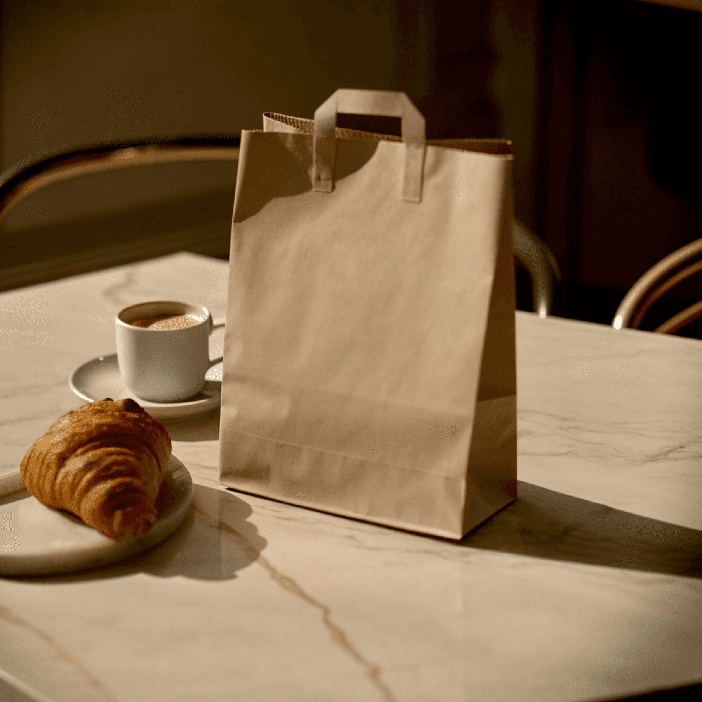
Textured, tactile packaging references the roasting process itself, so the brand feels made rather than manufactured. That craft cue is what earns a second look on the shelf.

The Outcome
Origin as story
Each bag carries the farm, the altitude, and the hands behind the harvest, turning packaging into a small piece of storytelling. Transparency became the brand's whole personality.
We built a flexible label system so new single-origins slot in without a redesign. It keeps the range feeling fresh while staying unmistakably Marrow.
Next Project.
Keep exploring—here’s another project from our studio, shaped by the same care and craft.

